Just in case you were wondering.
BookPillar is a private publishing concern, begun in Houston, Texas (2015), with a view to providing quality, cost oriented materials for Christians wanting to learn and teach the truth. We keep the cost of our books low by only taking the profit necessary to keep software, fees, services, and equipment up to date. While contemplating the creation of Book Pillar, our goal was not to make money; instead, we wanted to take truth to the digital and printed media in an affordable way, that would also take class material to a higher level. We wanted to provide an extra challenge to grow, for Christians who really love God’s word. Guiding all of this is our conviction that we must speak where the Bible speaks, and silently respect its specifics, not reading into Scripture what we desire. We hope to foster that same view of Scripture in those who read our books.
We are not a denominational publishing house, nor are we governed by any independent church, or religious body. The material in our books is strictly based upon Scripture, and finds friends among those who want a "thus saith the Lord." Sowing the pure seed of God's word is our passion. And, while much of the religious world will not like the strong stand we take on many Bible subjects, we know that seeking the "old paths" is far more important (a worthy procedure for all people cf. Jer 6:16).
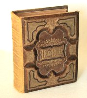
We believe our typography is worthy of special mention here. The typefaces (fonts) we use in our print editions are all produced "in house." Of special interest is our Tertius typeface (which is used for the main body of text in our books). Tertius (Origin of name - Romans 16:22) was actually developed from the typography in a 19th century family Bible (seen at left). It seemed rather appropriate that such an elegant printing of God’s word from days gone by should lend its graceful letters to our studies of the greatest story ever told. That same Bible is on the front of our Sound in the Faith class book. Some of our other fonts were also taken from 19th century type specimens. Other fonts are the result of original "in house" artwork (e.g. Arabia - Lesson titling for our upcoming textbook, The Kingdom of the Messiah.)
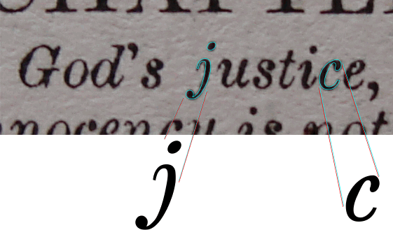
At left, is one of the images taken from that family Bible mentioned above. It is part of an editor's note just below the chapter designation. This particular image was valuable because of the clarity of the italic 'j'. A great problem in capturing these characters is that ink bleeds on paper (especially in that age which lacked special papers with high-tech surfaces). Over time it becomes very difficult to find a 100+ year old character that has not been distorted by age and physics. That problem with bleed can be seen in the two s' in the image (especially the first 's').
To create our Tertius font, the best surviving characters were photographed and imported. These images were carefully sized for consistency, then the character images were carefully traced and converted into a digital typeface, or font (character by character). Various styles and weights were created, and finally the kerning adjusted to maximize readability. Although those four sentences make the process sound easy, it is actually a very painstaking process, with several steps between. The goal of these extraordinary steps was to provide our readers with an elegant 19th century style, that we hope will add appeal to time spent in the study of God's word
We are small, but hope to provide numerous options for elders, preachers, and teachers in years to come. If you are not on our mailing (e-mail) list, please consider signing up. We won't pester you every week, but you will learn about new releases, be alerted to free Kindle days, and gain access to discount offers.